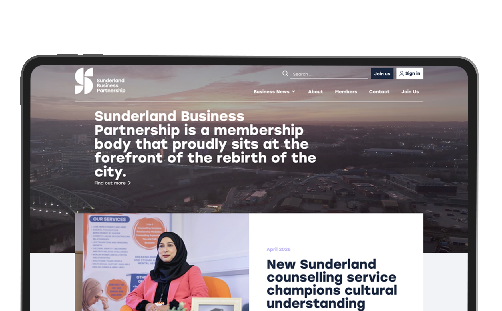
Sunderland Business Partnership
A multi-role permission system designed around editorial control, without making content submission feel like a bureaucratic process.
A multi-role permission system designed around editorial control, without making content submission feel like a bureaucratic process.
Research
Three user types with conflicting needs
The project started with stakeholder conversations to map how content moved through the organisation, who submitted it, who approved it, and where the process broke down. The core design challenge emerged quickly, this wasn't a content problem, it was a permissions problem, and the three types of users involved had fundamentally different needs.
Partners wanted to submit content with as little friction as possible. Affiliates needed to act on behalf of partners, but within clearly defined limits. The organisation needed a reliable approval gate on everything, without it becoming a bottleneck that recreated the problem in a different form. Designing a system that felt simple to each user type, while enforcing the right constraints underneath, was the central UX challenge.
Partners wanted to submit content with as little friction as possible. Affiliates needed to act on behalf of partners, but within clearly defined limits. The organisation needed a reliable approval gate on everything, without it becoming a bottleneck that recreated the problem in a different form. Designing a system that felt simple to each user type, while enforcing the right constraints underneath, was the central UX challenge.
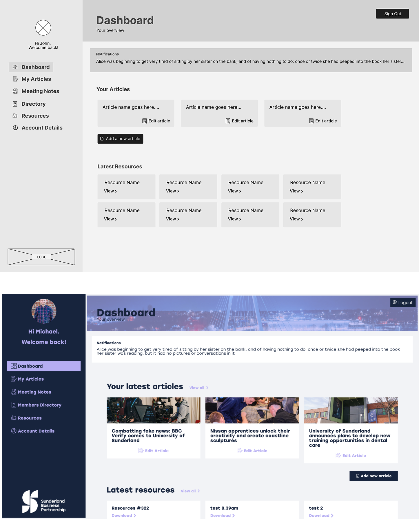
Wireframe and design of account dashbaord
What I did
Designing for three users at once, without exposing the complexity to any of them
The user flows were mapped separately for each account type before any interface work began. Each role needed a different journey through the same system, what a partner sees when they log in, what an affiliate can and can't do, what the approval queue looks like for the organisation's team. Getting those flows right in wireframes, and testing them, meant the complexity was resolved before it became a build problem.
The visual design kept each journey as simple as possible. The permission constraints operate in the background, users encounter only what's relevant to their role, without being confronted by the system's full architecture.
The build included a public-facing partner directory that populated automatically based on account type, removing the need for manual maintenance. The approval workflow gave the organisation a consistent checkpoint on every piece of content before it reached the live site.
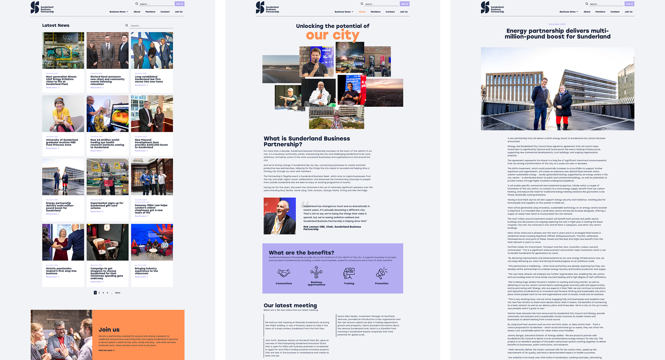
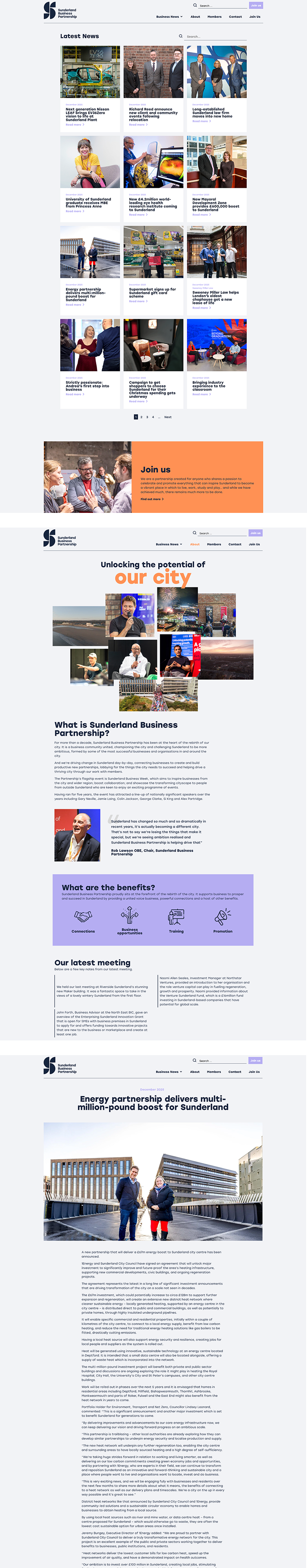
Screens for latest news, about and article example
Outcome
Partners self-serve. The organisation stays in control.
The new platform removed the content admin bottleneck entirely. Partners submit their own updates. Affiliates can post on behalf of partners within clearly defined limits. The organisation reviews and approves before anything goes live, the same editorial control, without the manual overhead of managing every submission themselves.