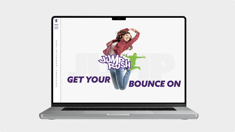
Jump Rush
Improving the user experience of a leisure client website
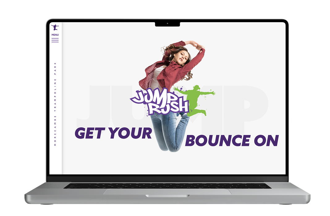
Jump Rush, a family-focused trampoline park in Morecambe, needed an updated website to better serve its visitors. While all user types, goals and pain points remained the same, the original site was designed and built before content was fully defined. Having built the current site originally this was a great opportunity to improve the website using everything I had learnt since the site launched.
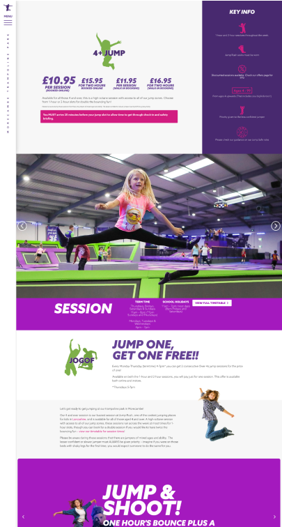
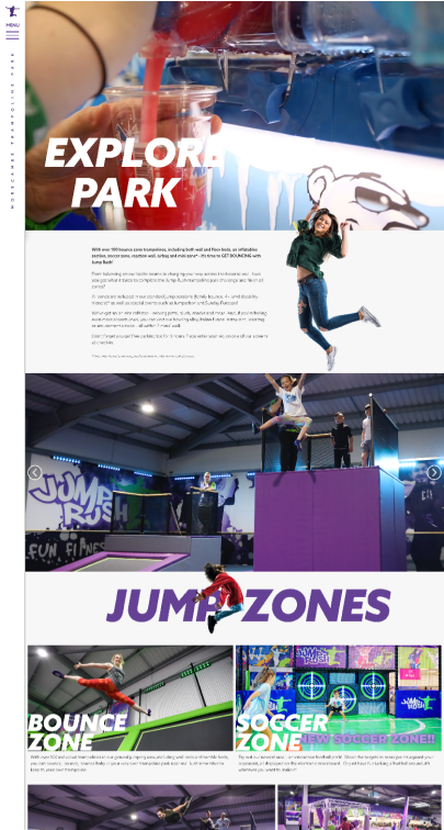
The goal of the redesign was to improve the overall user experience, presenting information on session types, safety guidance and what to expect on day, all in a mobile-first design for the local and regional visitors.
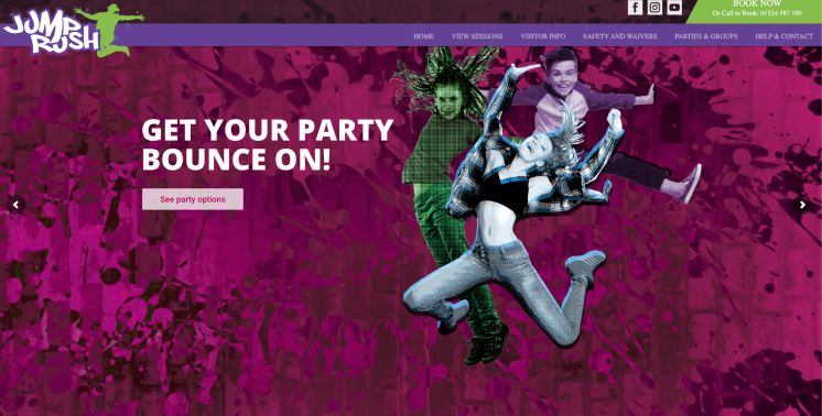
I began the project by auditing the website to identify where pages were not flowing well and where content was not as clear as it could be. Although the user journeys needed to remain the same, the layouts for each page needed to be improved to make the information easier to find and to guide the user to begin booking.
The main pain point for the user was simply that it was hard to use. To fix this, I created high-fidelity designs that reorganised the content to show a clear hierarchy of content and make the pages easier to scan.
Due to a limited budget additional research or user testing was not possible. The redesign relied on proven UX principles and my understanding of the audience to deliver a significantly improved experience.

Following the launch, the redesign of the site delivered a clear, more useable experience for users. Stakeholders reported fewer customer questions, and content was clearer and less confusing.
The new site was easier to maintain and update for stakeholders and feedback was overwhelming positive.