Dame Alan Schools
A school with an exceptional offering, a genuinely bad website, and eight weeks before the most critical point in their admissions calendar.
A school with an exceptional offering, a genuinely bad website, and eight weeks before the most critical point in their admissions calendar.
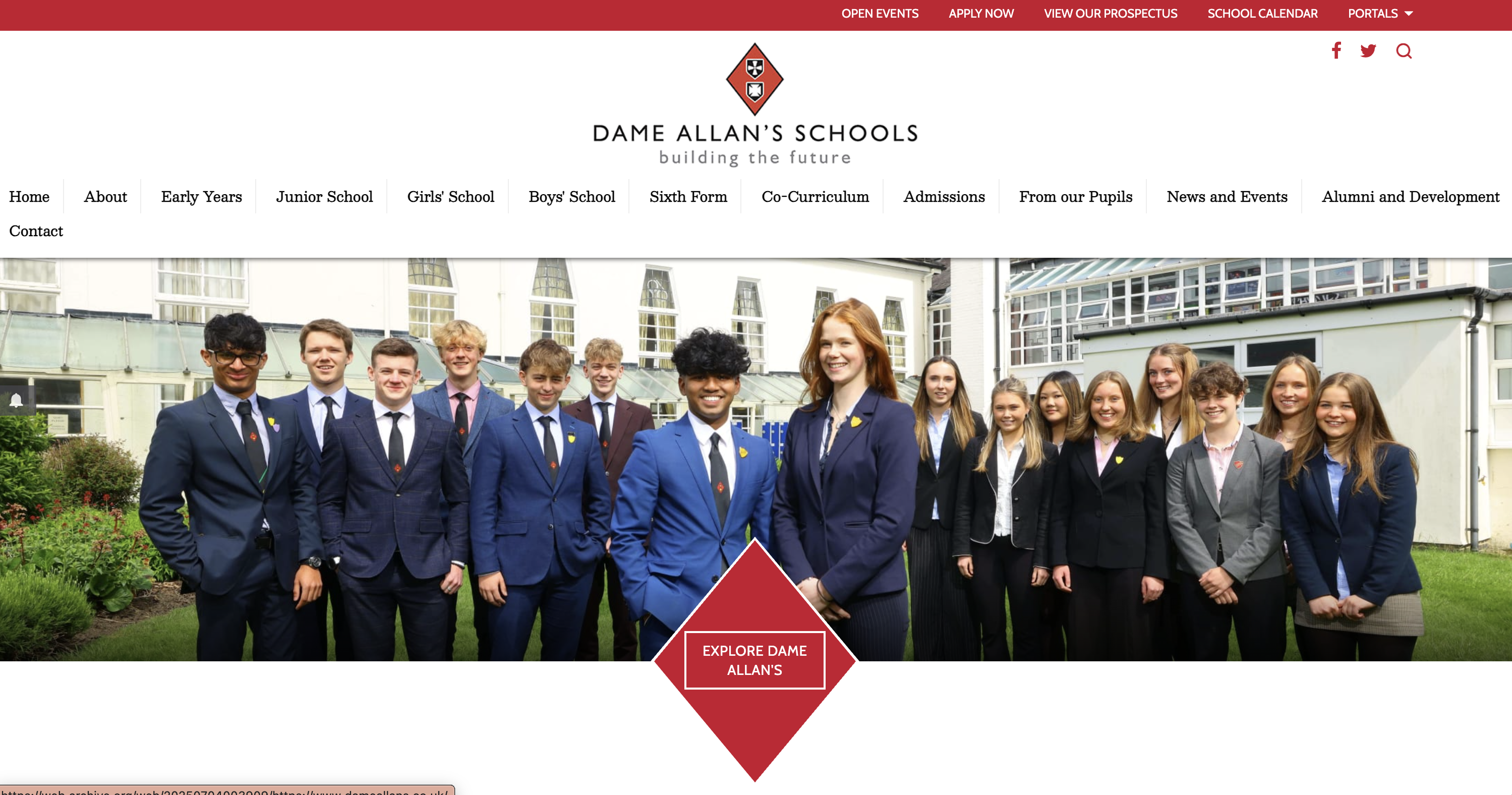
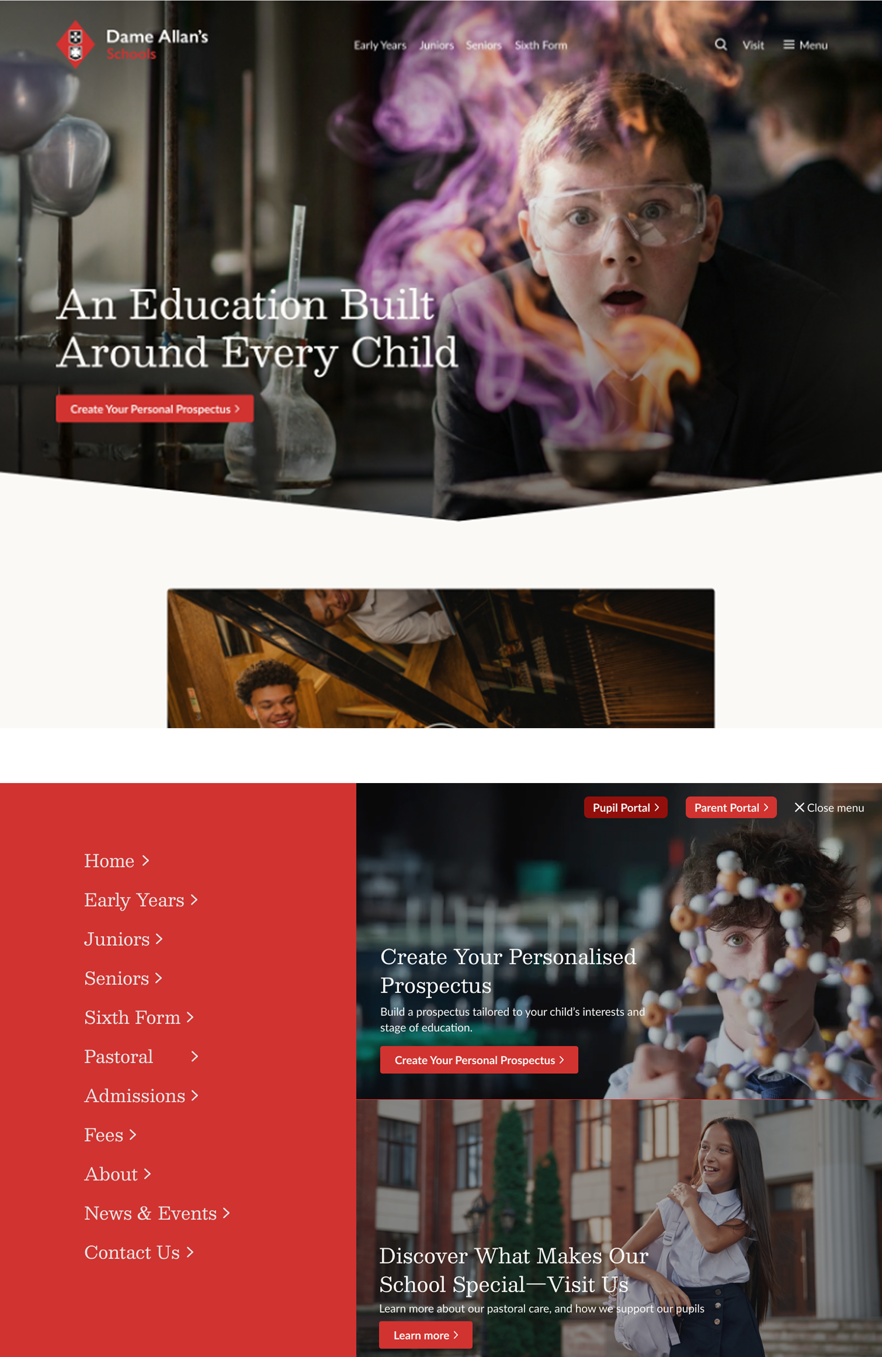
Homepage before the redesign
What the research revealed
Starting with the right questions
Before any design decision, the project started with research: understand what parents actually need when choosing an independent school, and what the site needed to do commercially. Everything that followed came from that.

5 stakeholder interviews

5 user interviews

5 rounds of user testing

Affinity mapping
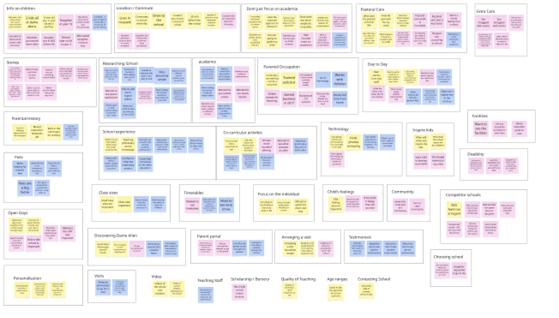
Dame allan affinity mapping
1. Fees were important — and hard to find
Every interview surfaced the same frustration. Parents expected fees to be easy to find. Some couldn't find them at all. The fix wasn't just a fees page, fees went into the main navigation, visible from every page. Bursaries and scholarships were also clearly separated; the research showed parents consistently confused the two, and the old site did nothing to help.
2. The co-curricular offering was the school's biggest selling point
Stakeholders knew the programme was exceptional. The site didn't show it. A full co-curricular section was built, not a single page but a structured architecture, with each activity given its own dedicated page and the prominence it deserved.
3. Parents prioritised pastoral care & the site treated it as an afterthought
Wellbeing came first in every parent interview. Academic results mattered, but they came second. The site was given a dedicated pastoral care page, structured by age group. Not a statement of school values but a demonstration of them.
4. The open day was the highest-value conversion point on the site
Stakeholders knew it from experience: parents who visited were almost always convinced. The site's job was to get them through the door. Open day became the primary call to action across the entire site and every page carries it.
Three personas were built from the research, Emma (the research-driven parent), Sophie (the busy professional), and Raj (the aspirational academic parent), and pressure-tested against every design decision.
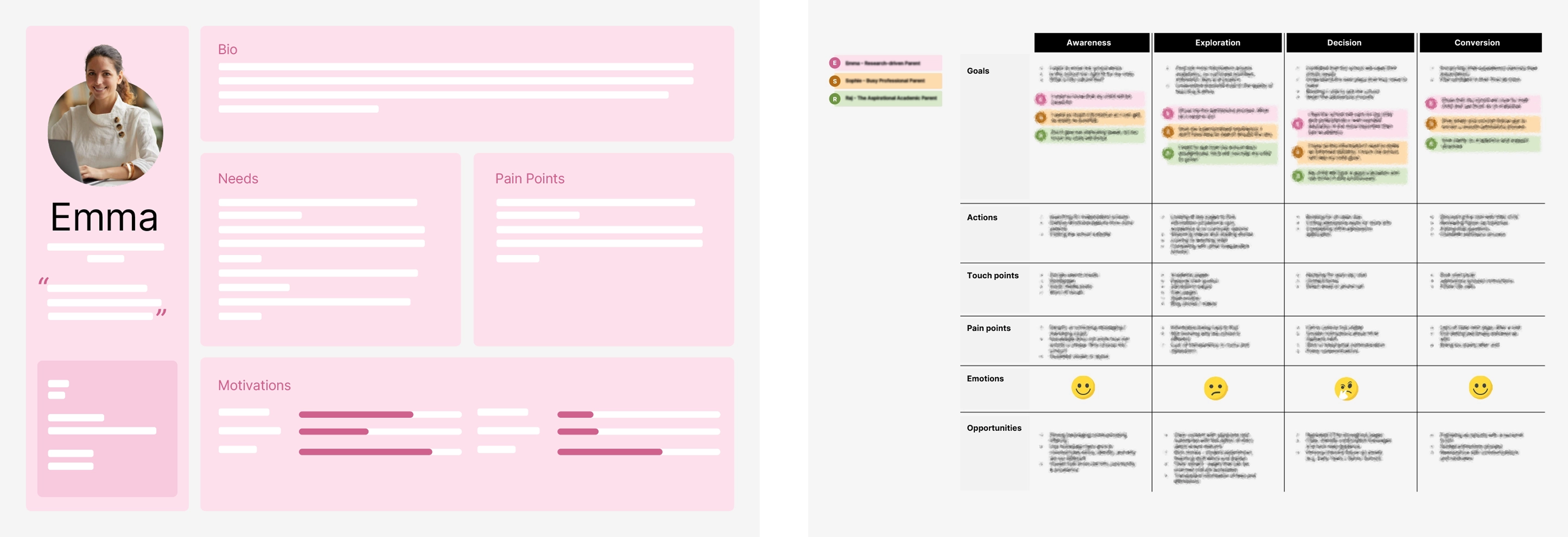
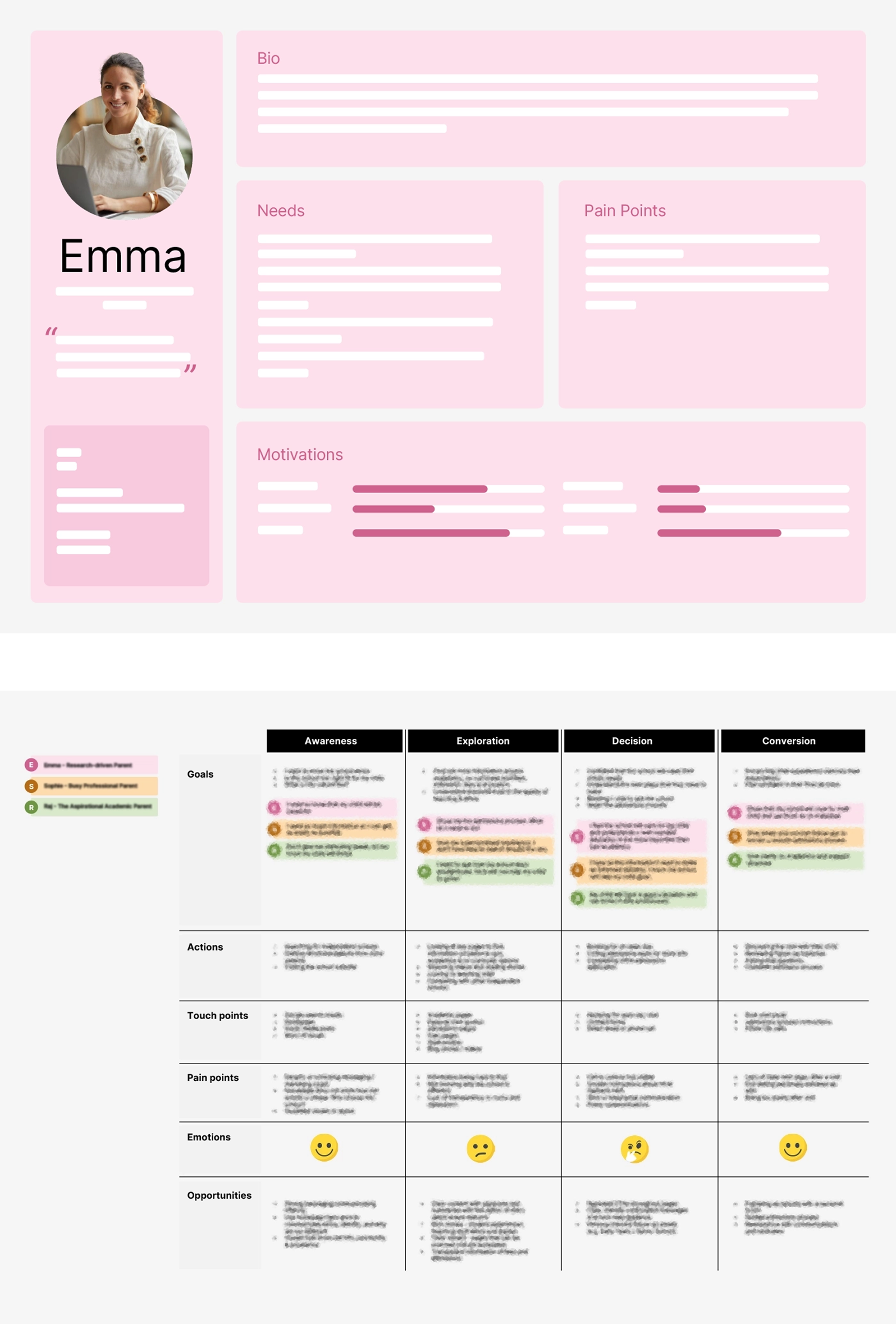
Dame Allan’s persona and journey map
From research to design
Structure before style
The information architecture was built directly from the research, not from what the school wanted to say, but from what parents needed to find, and in what order. Over 100 pages, each with a defined purpose. Wireframes followed before any visual work began.
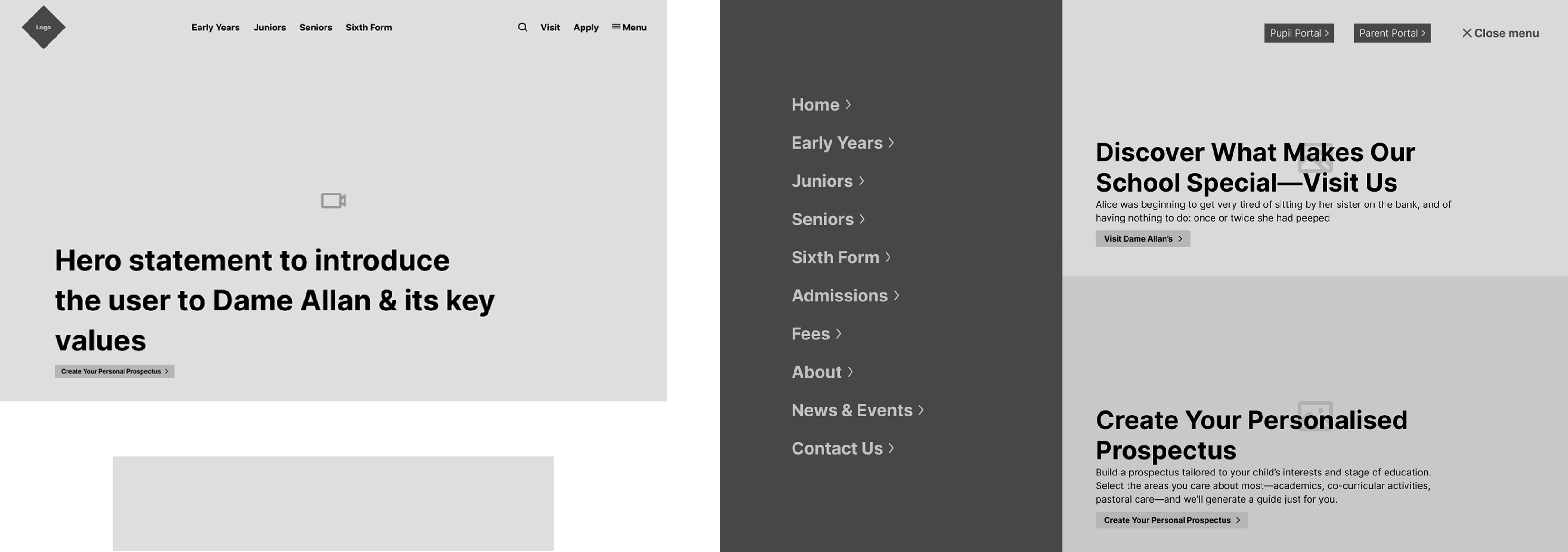
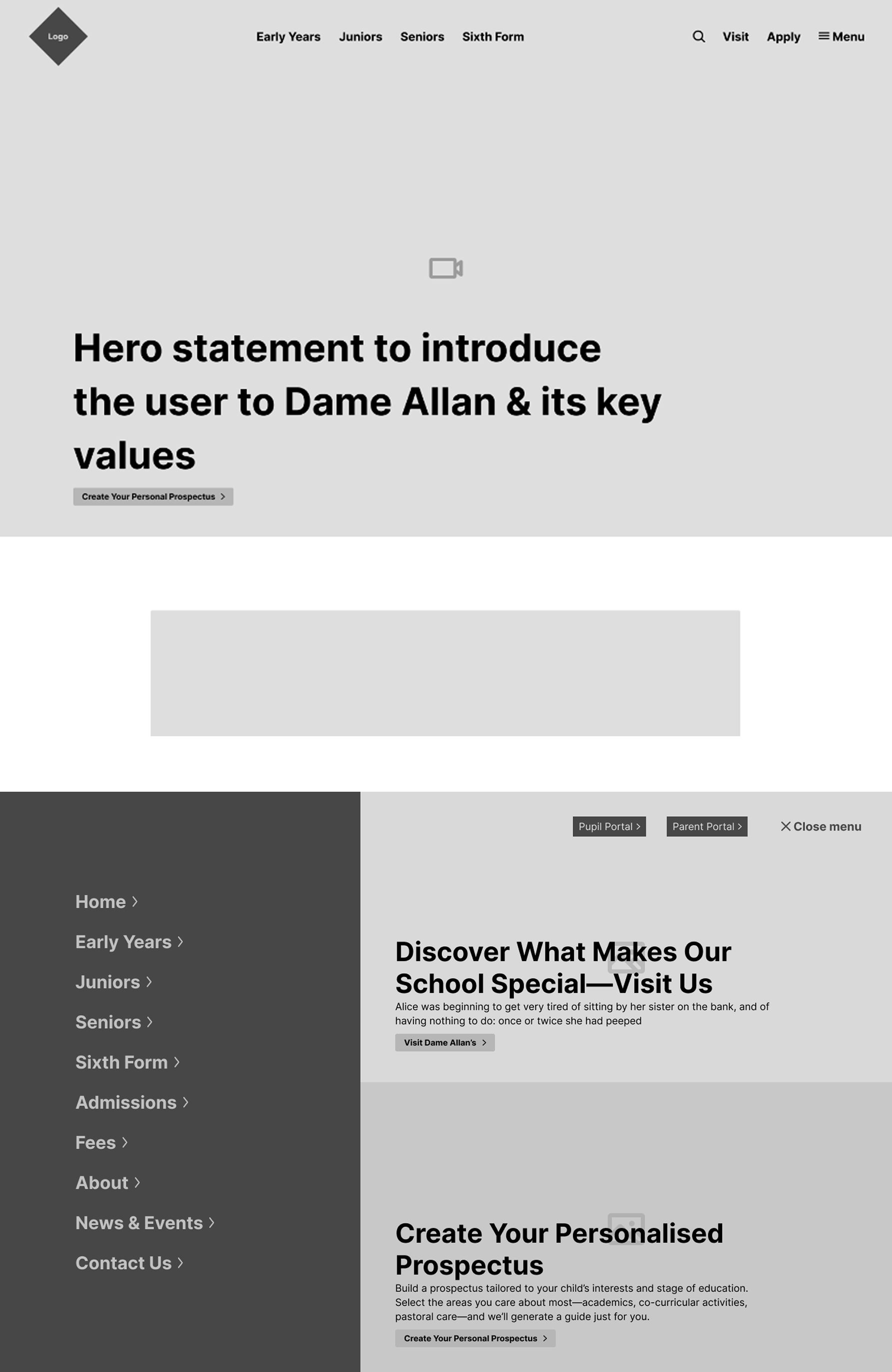
Wireframing
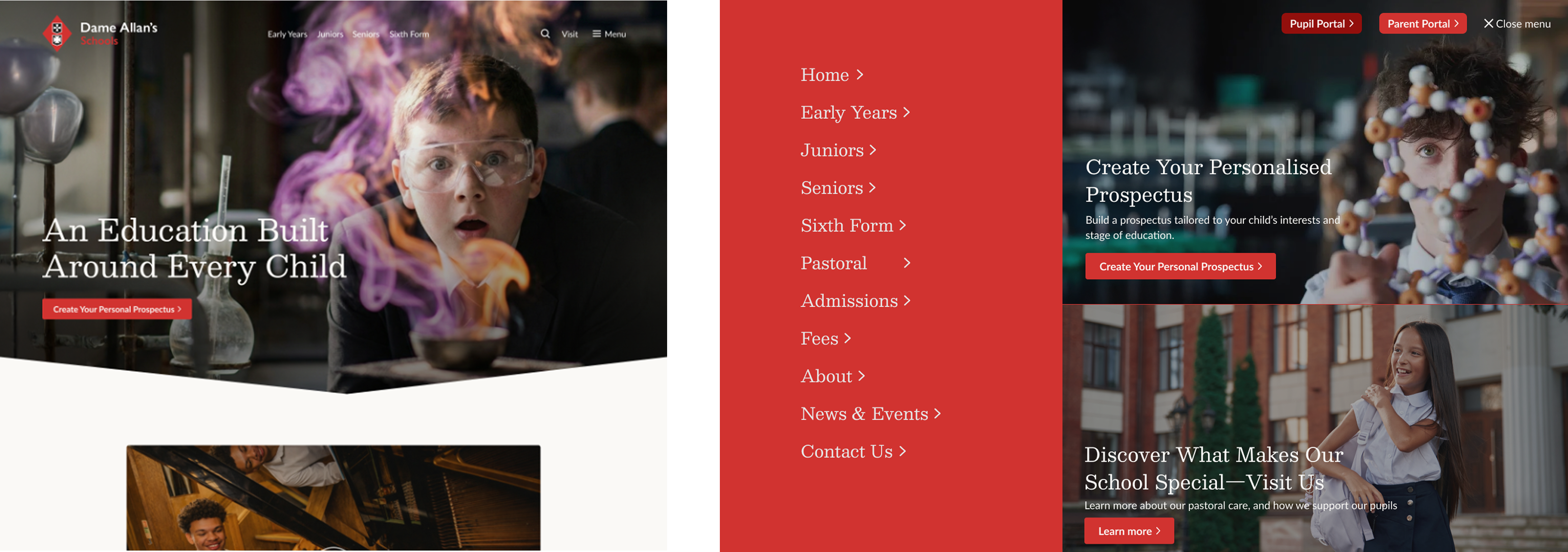
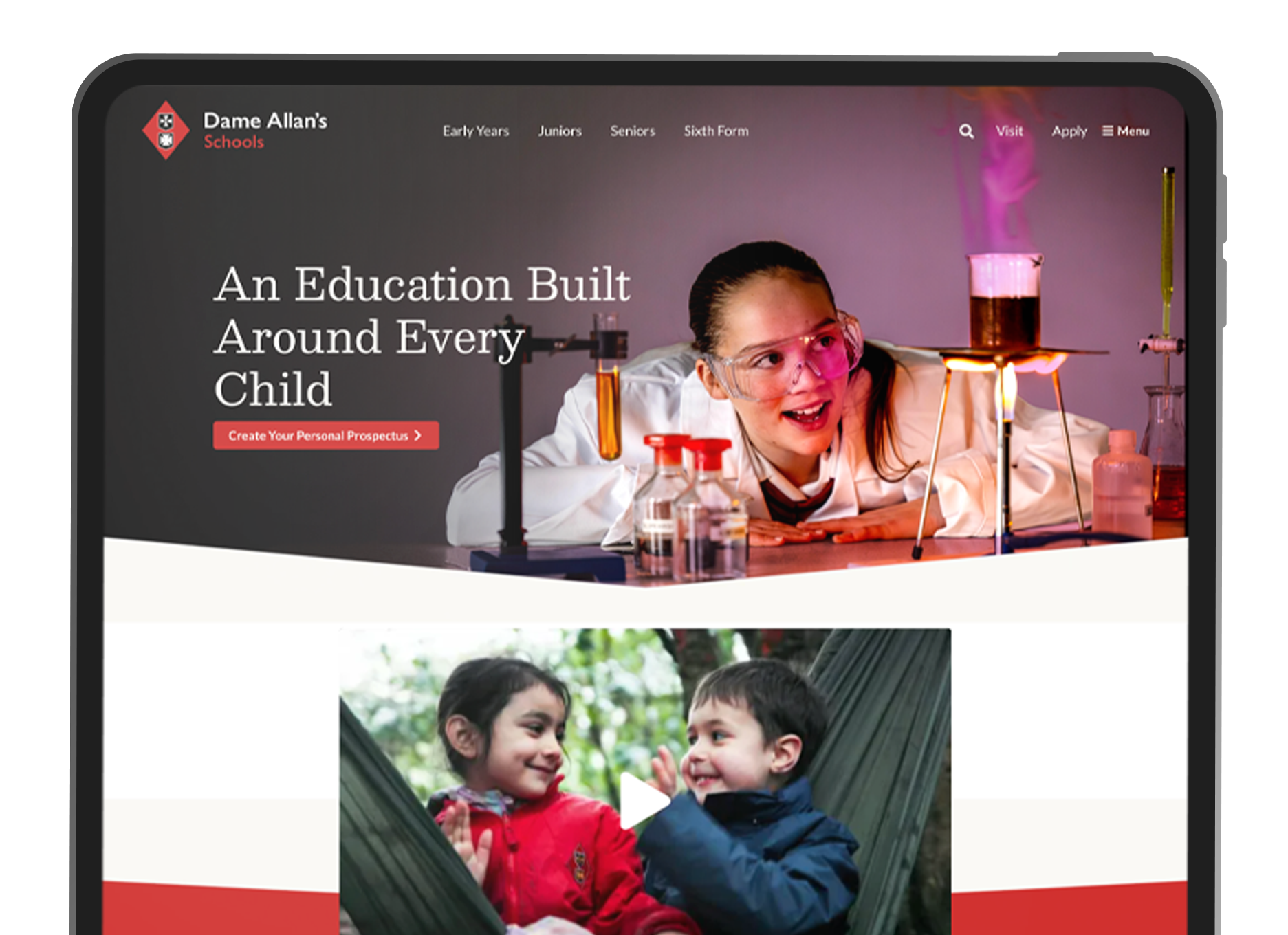
Design
Outcome
Launched on deadline
The site went live before offer letters reached households, ready for the audience that mattered most. The full UX process ran without being cut to meet the timeline: stakeholder and user interviews, affinity mapping, personas, journey mapping, sitemap, content map, wireframes, design and build.
One thing I'd do differently: content production needs its own timeline, scoped upfront. With over 100 pages and a fixed go-live, some pages launched with the right architecture but copy that wasn't yet where it needed to be. It's a lesson I now build into every project with a hard deadline.
“Michael was fundamental in the success of our new website. He managed a very tight set of deadlines with ease and was a pleasure to work with.”
Amy Patterson, Senior PR and Communications Officer, Dame Allan’s Schools
 Visit live site